Illustration Design
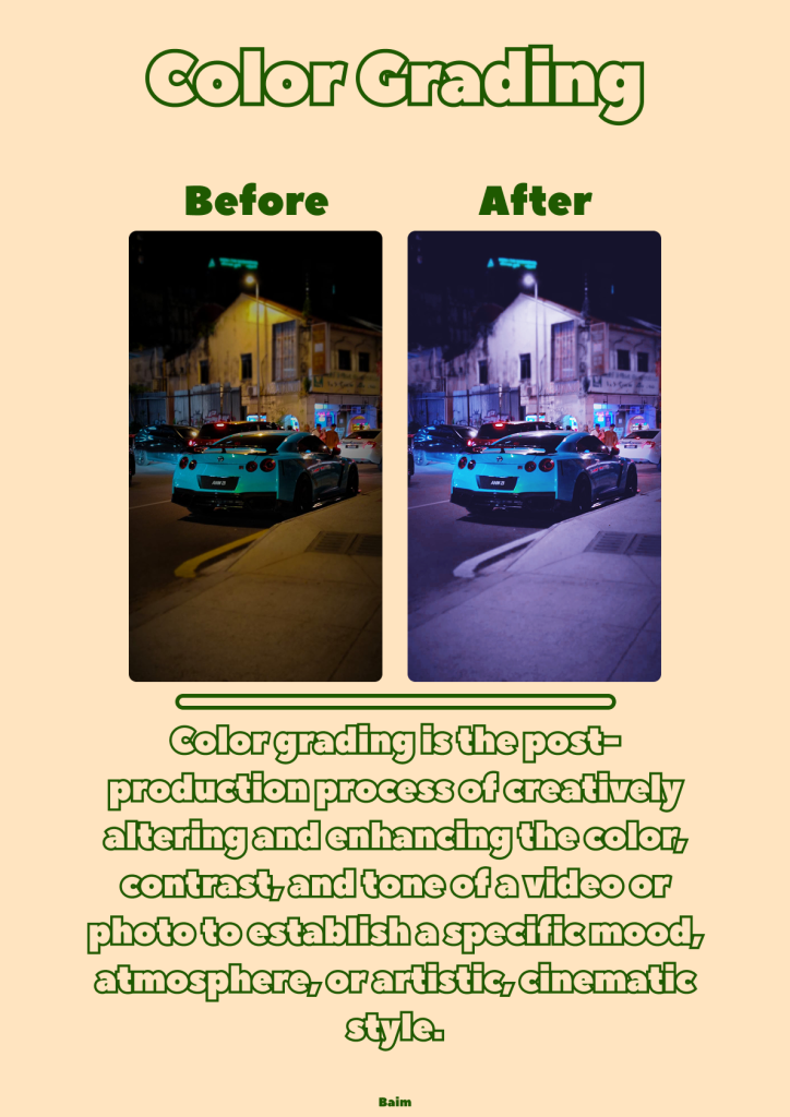
This image is an educational design poster explaining the concept of color grading in photography or videography. The poster uses a cream-colored background with green text elements, creating a clean and modern look. At the top, the large title “Color Grading” serves as the main focus of this infographic.
In the center, a comparison of two images is shown, labeled “Before” and “After.” The “Before” image shows a nighttime photo with natural colors and standard lighting. Meanwhile, the “After” image displays more contrasting and cinematic colors, with a predominance of blue-purple tones, creating a more dramatic and artistic atmosphere. This comparison helps visually demonstrate how color grading can change the mood of an image.
Below, it explains that color grading is a post-production process that alters and enhances the color, contrast, and tone of a photo or video to create a specific mood or a more engaging visual style. The poster also includes the creator’s name, Baim, as the design identity.
Overall, this poster aims to provide a simple understanding of the importance of color grading in improving visual quality and creating a more professional and aesthetic appearance.